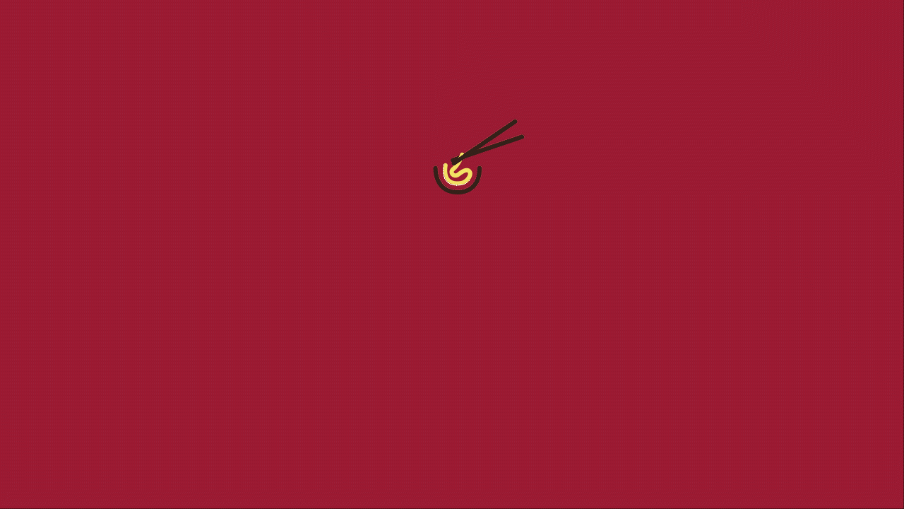
This is a brand identity I created for an on-campus Vietnamese restaurant. The name of the restaurant "gắp" is a Vietnamese word meaning "picking up food with chopsticks", which is the main way to eat Vietnamese food.
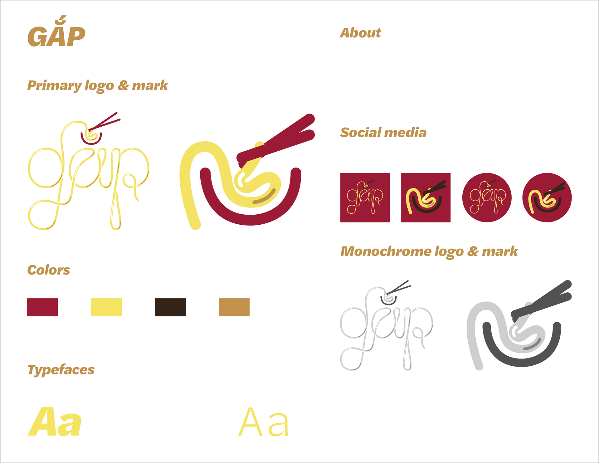
I incorporated the logo's noodle shape and the momentum of using chopsticks to pick up noodle to the logo animation to emphasize the service and signature of the restaurant.
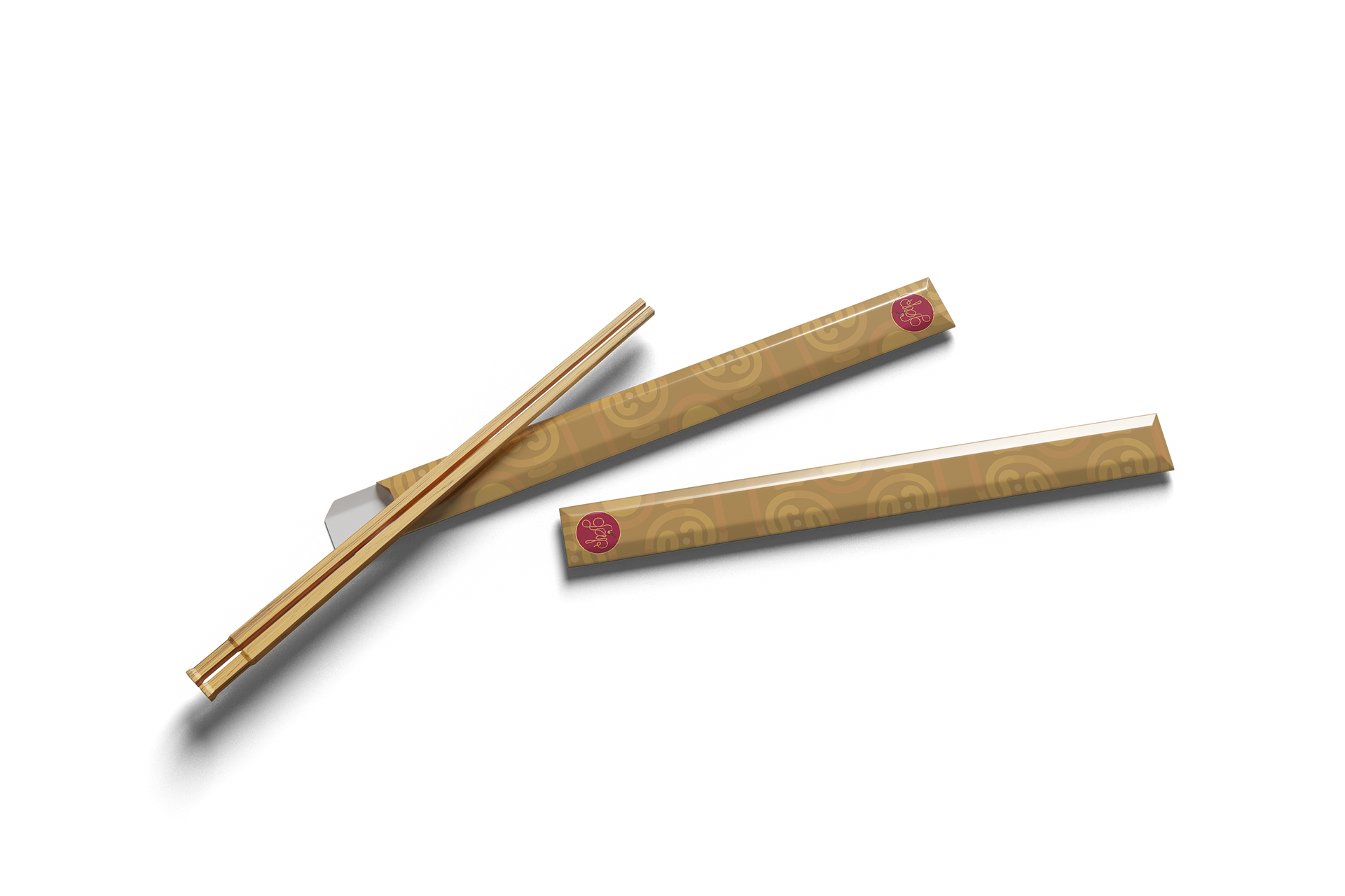
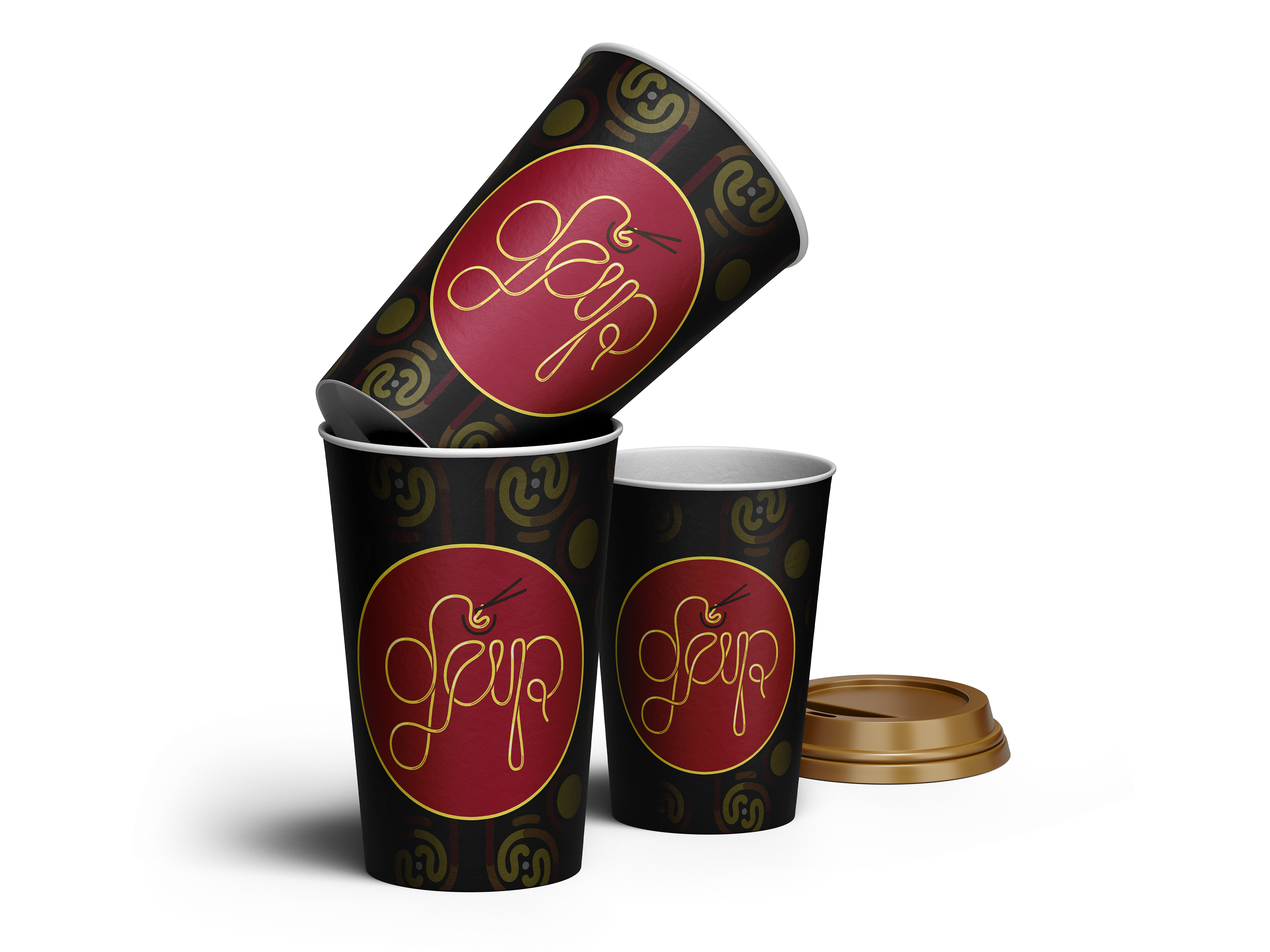
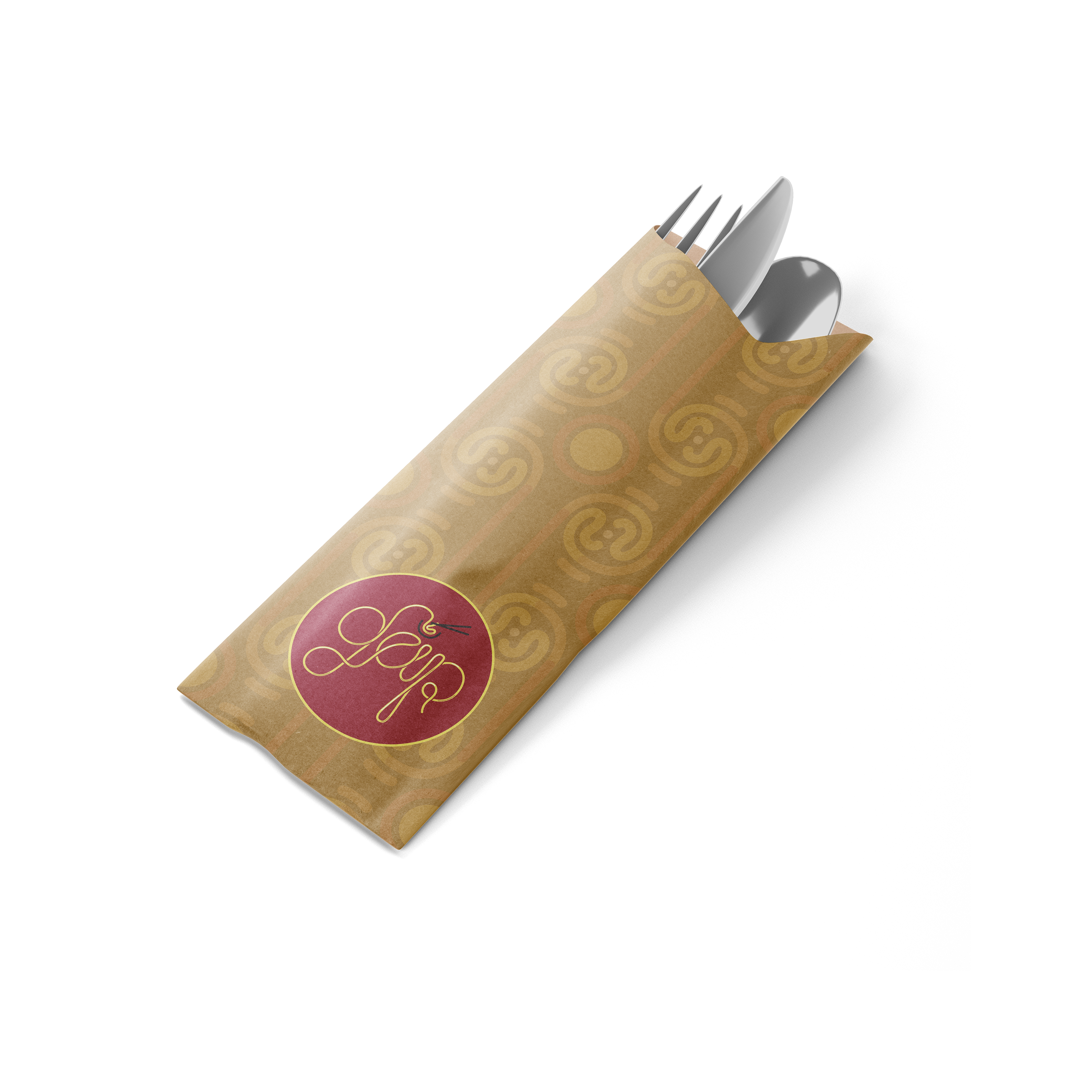
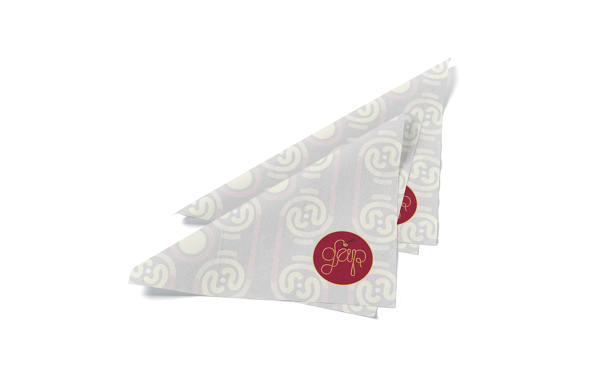
The brand pattern is used in all packaging items including bowls, chopsticks bags, cups, utensils bags, and napkins.
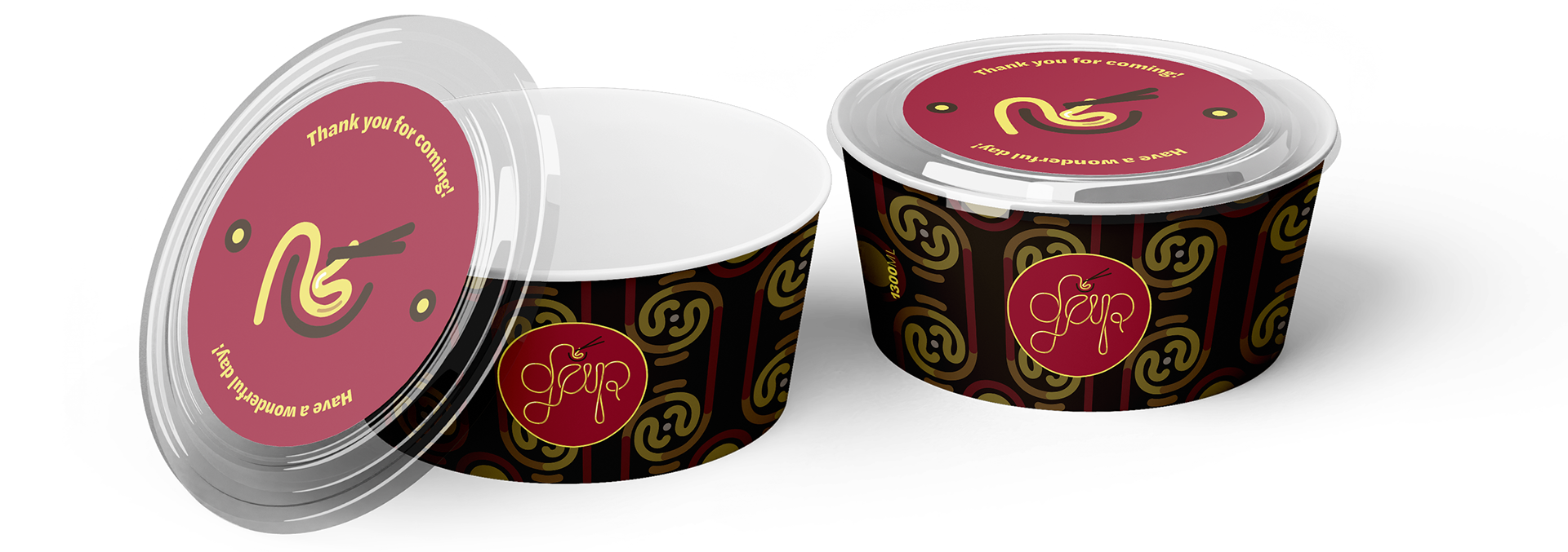
All customers will receive all items when they get food to-go from GAP.
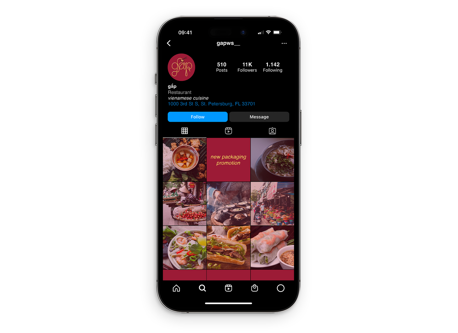
The social media post arrangement consists of images of Vietnamese food and designs with red and yellow tones to increase appetite and create a street-food-like atmosphere.